Nerdwallet
Redesigning the Member Home web and app-based logged-in dashboard resulted in meteoric improvements in user engagement and user value.

Company
Nerdwallet is the personal finance industry leader for credit card, loan, and personal financial products from reviews to qualification and enrollment. Its thought leadership platform is run by and content written by the brightest, unbiased journalistic minds in the industry. A logged-in experience focused on helping people see and improve the “big picture” (net worth), “little picture” (spending), credit score, and reward point management consumer journeys.
Challenge
This project was about elevating the logged-in user’s experience gaining insights and recommendations for action to the level of Nerdwallets content and financial product enrollment and review experience. This challenge was about listening to the user and meeting their needs by linking the register experience to the first-time use experience to deliver immediate value. This “payoff” of the brilliant brand campaign promise for membership builds brand equity and trust but also sought to bring the user value and long-term financial benefit. At the start of this project, the existing experience looked non-existent, conversion was abysmal and the logged-in experience offered little value.
Work Description
I led a team of brilliant designers, strategists, and researchers to ground the work in real persona needs and data insights, and ultimately build a rapidly-iterated product experience. It was a multi-disciplinary approach, and my focus was on unifying leadership to align on expectations of phases of work and empower talented individual contributors to simplify, level up and build a modular, expandable experience. Together we built a “bookshelf” concept, which over time could be updated with smart AI-driven engagement widgets highly personalized for every user.
Results
We expected improvements, but not at the level of success we would ultimately achieve. The numbers were so staggering, we had to vet, analyze and double check what was happening was authentic. We succeeded beyond our wildest dreams to bring engagement and action to people and fulfill the mission of the team to improve the short and long-term financial lives of our members.
Details

A literally non-existent welcome. It was no surprise that just-registered users immediately dropped off when greeted by a sea of nothingness after joining the platform. Use of the word “lock” only exacerbated the sense of unwelcome.
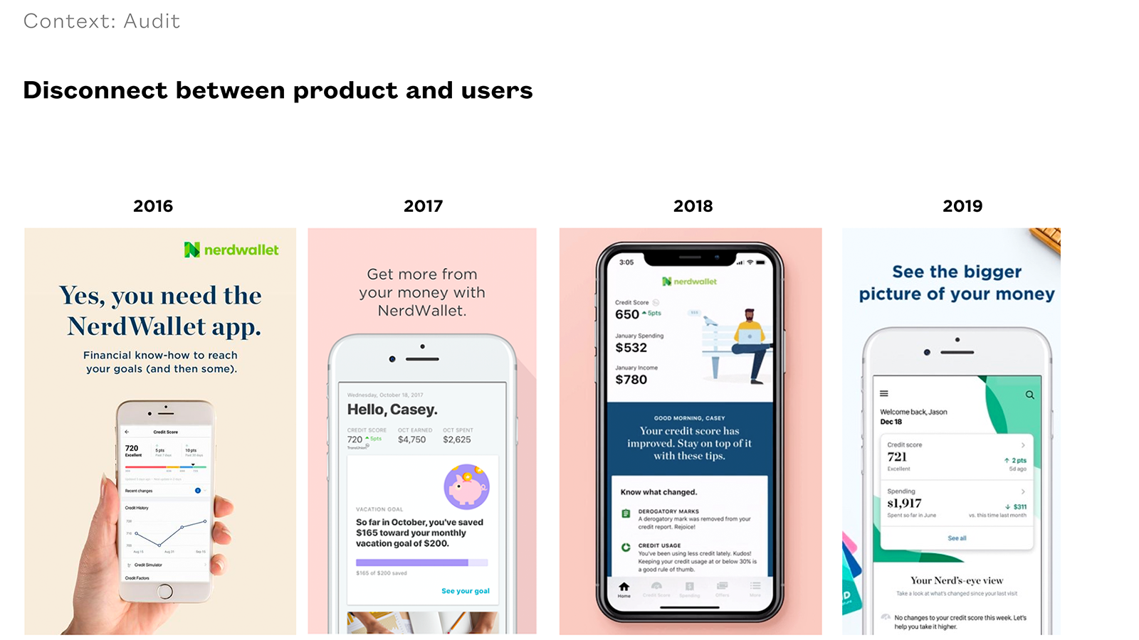
Historical Perspective As we dug through the archives of the product team, we realized there was a legacy of insight to revive, but also to improve upon by clearly targeting persona needs with specific functionality and information delivery.

Targeting Core Personas On-strategy, on-brief UX Research and market segmentation allowed us to design for the right audience, which also was a challenge in and of itself: to create targeted experiences for people joining Nerdwallet with ANY financial profile.

Rapid, low-fidelity Concepts A deliberate effort to explore early concepts was grounded in Design Principles and worked on any screen, and was modular, expandable, and featured dynamic, personalized content. We started with three but the “Bookshelf” ultimately was the mode flexible and modular, in support of rapid product releases, with fast-follows and immediate progress release after release.

Modularity and the Integration of Smart AI-driven UI Building the idea of populating a modular layout dynamically, we coordinated with various teams across the org and achieved a marvelous experience. Through unifying data analytics, AI, and back-end engineering teams to build data models and logic that were truly intelligent and yet invisible and beneficial to the user, inputs received in the Register flow were sensed, reasoned, and executed (the baseline three parts of AI) in the form of content recommendations, UI layouts with prioritized tasks, and ultimately adapted over time and incorporated user behavior and financial activity.
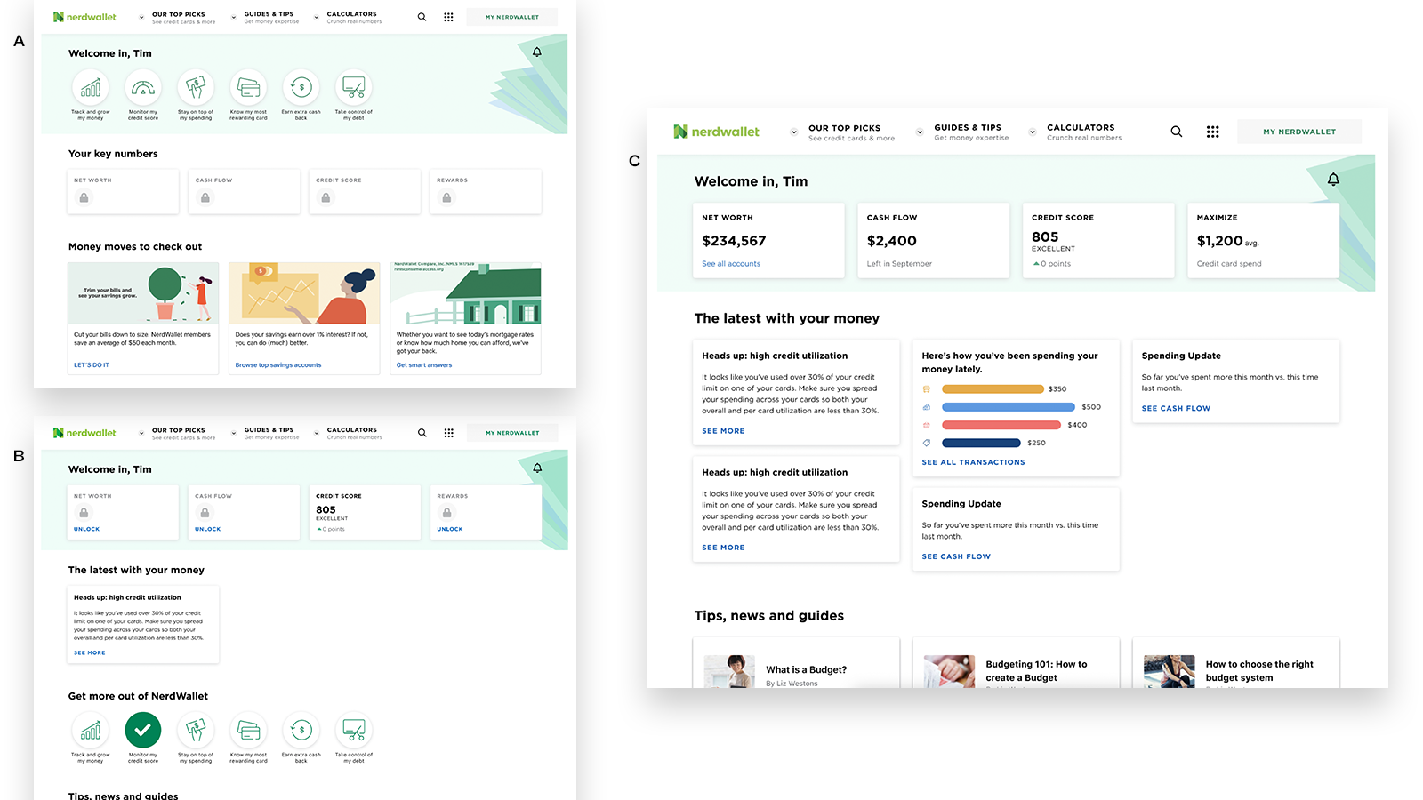
An Evolving Experience No place is better to go than the desktop web experience to view the evolution of a personalized dashboard along the phases of the user journey. (Note: this project was for both web and app-based logged-in experiences.)
[A] The Very First Moment of Use: focused on personalized, required tasks
[B] “Second Login:” With just one task complete, the dashboard evolves into a different layout and further encourages “progressive onboarding.”
[C] Long-term Use: over time, the Member Home dashboard experience becomes a digital command center for one’s financial health and progression
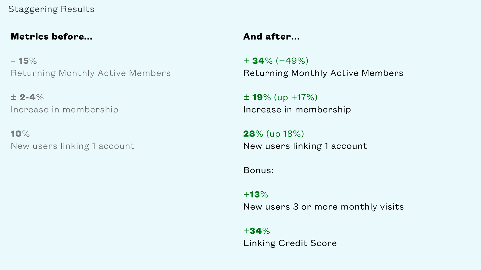
The Outcome These numbers are not made up. Our team celebrated the success of this project and it remains a career high for me. It is the coalescence of design thinking, user-centered design, unbiased research, agile design and development, and authentic collaboration to push the strategy and mission of the company forward
Job & Role
Senior Product Design Manager
Participation
Strategy and Design Leadership, Facilitation of Multiple Design Thinking Workshops, Product Strategy, Mentorship, and both hands-on and oversight of deliverables
Abilities
Agile Design/Development Methods, Brand Strategy, Sustainability Ethos Compliance, Sustainable Business Model Development, Service Blueprint Design, Storytelling, Use Case Definition, Research Synthesis, Scenario Development, Journeymapping, Journey Moment Design, System Thinking, Art Direction, Workshop Facilitation, Data and Workshop Output Synthesis, Insight Development, Competitive Research, Analysis and Synthesis, Opportunity Analysis, Prototyping, Brand Instinct Development, Visual Interaction Design, Experience Design, Concept Development, Responsive/Adaptive Web Design, Mobile App Design, Environmental Design, AR/VR/MR Concept Development