Madison-Reed
This product-service system overhaul focused on simplicity and product design fundamentals for an industry disruptor. I led the team to create large impact through simple reorientation to best practices across the entire experience.

Company
Madison-Reed︎︎︎ has redefined a massive industry in unexpected ways: bringing true science, safety, and sustainability to hair color and beauty. Creating a digital services that offer personalized product recommendations, drive subscriptions, enable online consults, and merge virtual-physical experiences with brick-and-mortar salons are among M-R’s triumphs.
Challenge
The digital product was inconsistent, complicated, and too many growth tests lead by marketing—not product design—barely nudged conversion metrics but degraded the end-user experience. The design system was both non-existent or inconsistently applied, further exacerbating user hardship and stifling growth. Product development or improvement priorities were misplaced.
Work Description
Work backward from desired end-state goals for growth metrics and forward from a grounded, user insight driven UX perspective I led the work to redefine the experience journey through better product design. This started with two parallel tracks: aligning business and design priorities and conducting a design audit of the entire experience. These tracks coalesced with two outputs: cleaned up, better design system applied to external-facing UX and a clearly-defined product improvement prioritization for the long term.
Results
Cleaning up and simplifying the E2E journey reinforced the uniqueness of the Madison-Reed product brand. In so doing, we drove conversion upward, made the product more accessible, and within product roadmaps, sitemaps or high-value pages laid the groundwork for long-term sales growth. This furthered the Madison-Reed story of disruptive sustainability and empowering people to look and be their best selves. (Metrics confidential.)
Details

Adaptive design for
Smartphone web
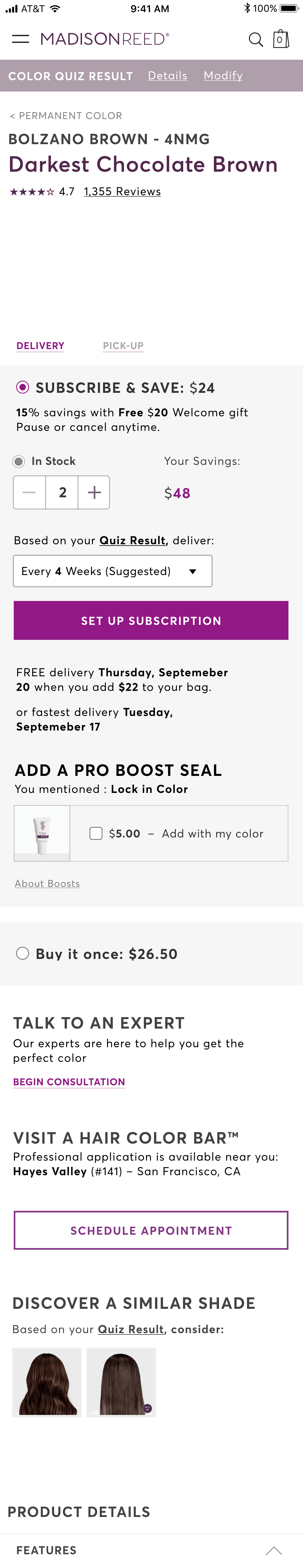
The Product Detail Page: Polishing the Crown Jewel The “after” is staggeringly improved than the “before” with prioritized content aligning with user persona needs (validate with research), a very strong mobile adaptive web design, and reinforced use of the design system and UX best practices.
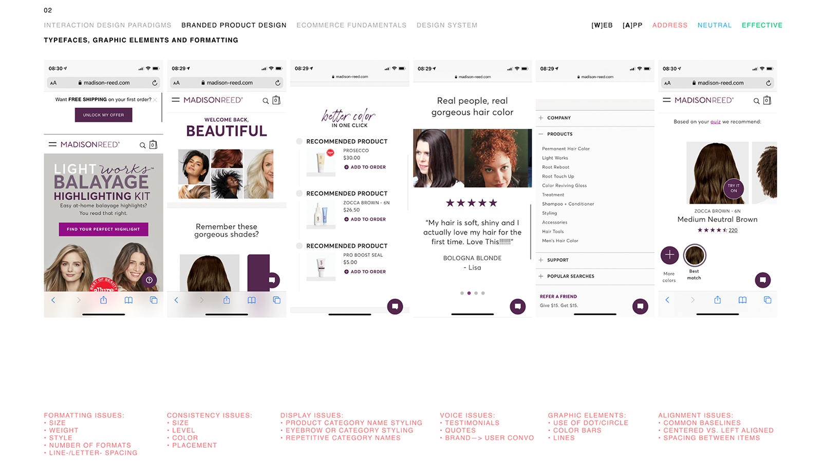
360° Product-Brand Audit The survey of hundreds of screens in every corner of the digital ecosystem reveal glaring flaws in this gap analysis. They were found across the sitemap for web and native apps including formatting issues, design system consistency, accessibility and readability problems, poor call-to-action/button placement, overuse of brand elements, lack of effective design system application, and more.
 Product Design Experience Audit After evaluating the product brand, I led the effort on a deep dive of the UX system—scrutinizing everything from the effort different flows deamnd of users, to best practice use of things like modals and tabs (the worst common offenders!), and proper, consistent implmentation of the design system. Not only did I lead the team to evaluate thUX, but challenged the approach of excessive marketing-led growth testing to define the UI. This turned out to be a source of most of the product’s degradation of UX design quality. The secondary yielded a criticality-based, prioritized list of product areas to improve with clear business purposes attached to user actions.
 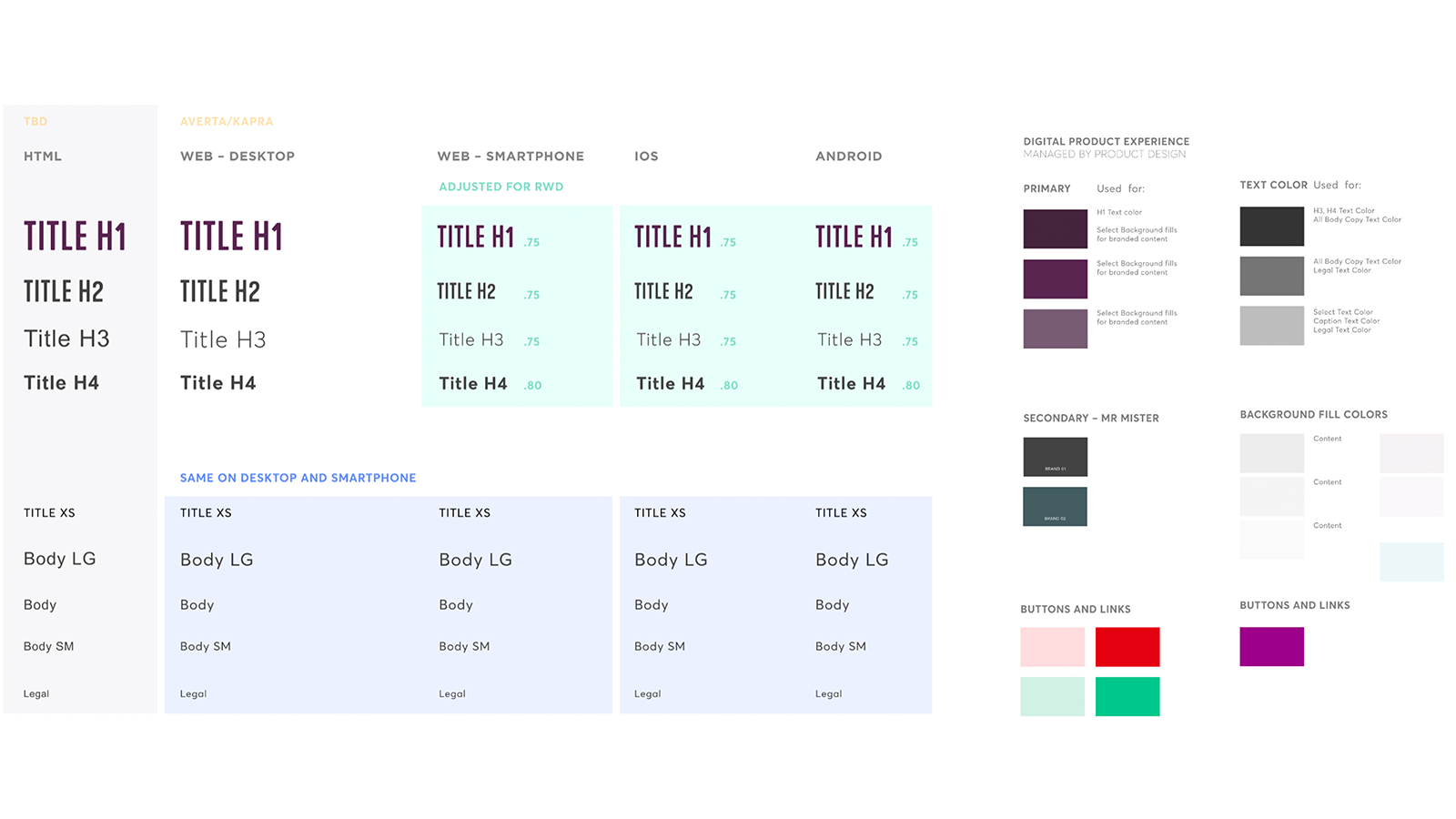 Less Is More Approach to Design System The first critical improvement was a massive simplification and improvement of the design system. For example, with typography I was able to eliminate disparities between web and app, desktop web and smartphone web by almost 150% in some cases… reducing the number of styles from 12 to 4, number of colors from 20+ shades of gray to 3, use of brand fonts from 6 to 3, and from 25+ sizes of text to just 8. Everything from type and color funadmentals to compontent libraries to accessibility and readability was leveled up.
Design System Impact:
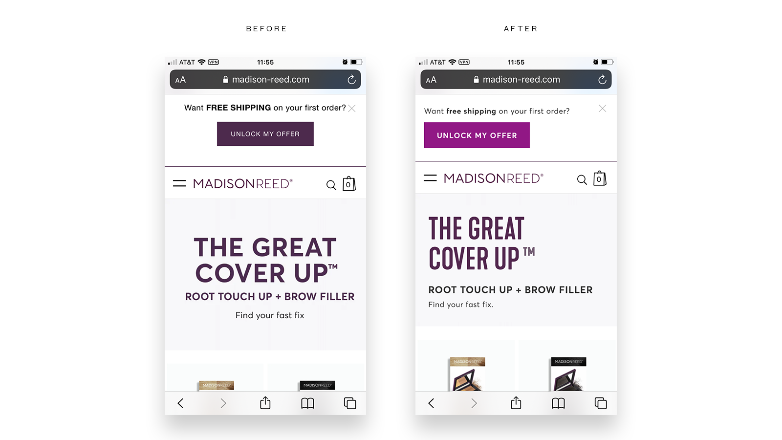
[Above] Elimination of center-aligned copy, better use of branded fonts, more impactful calls-to-action/buttons.
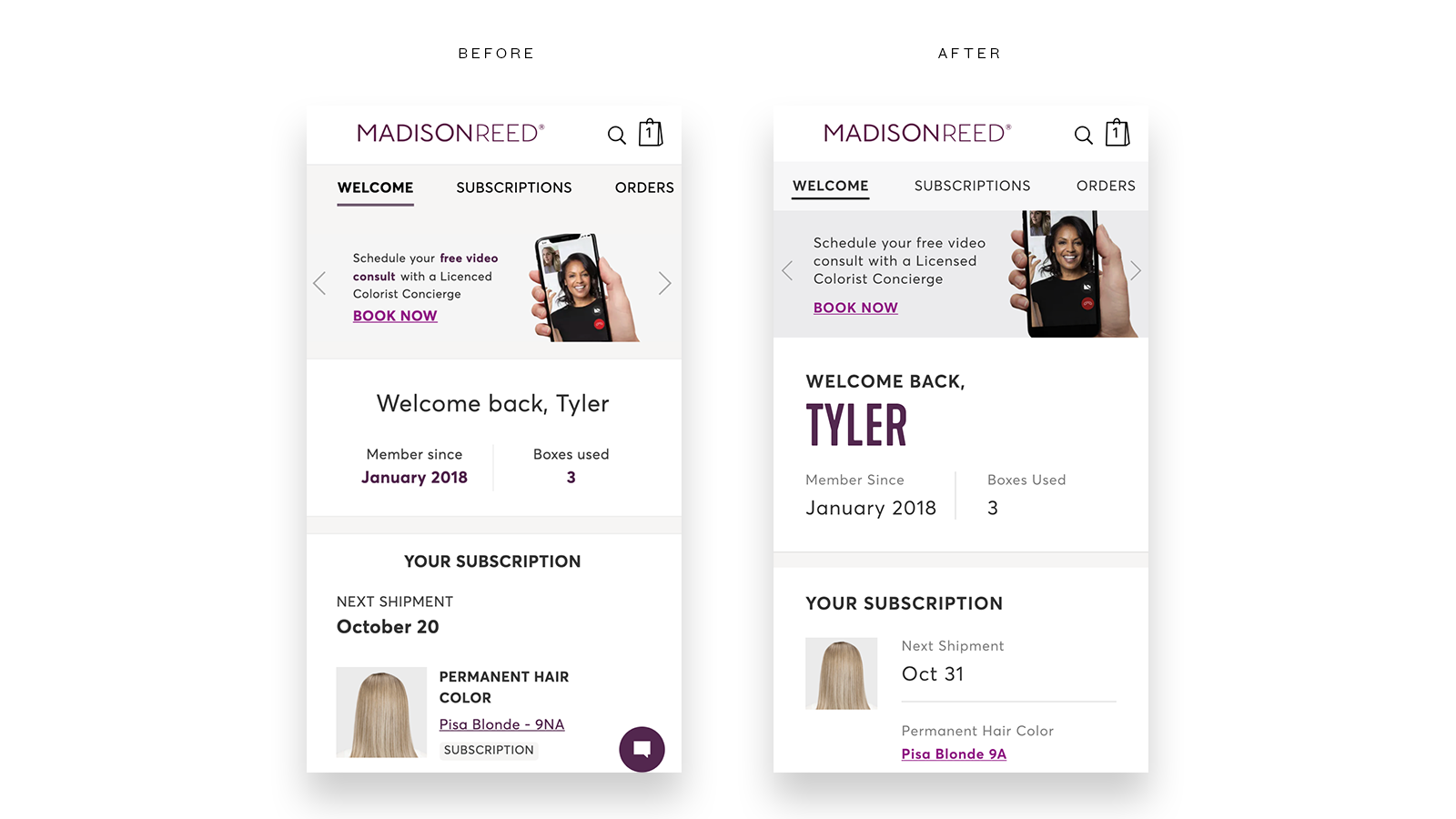
[Above] Gutted Welcome screen, more-visbile body copy in product and engaging user, improved CTA and branded font use, and corrected visual hierarchy.
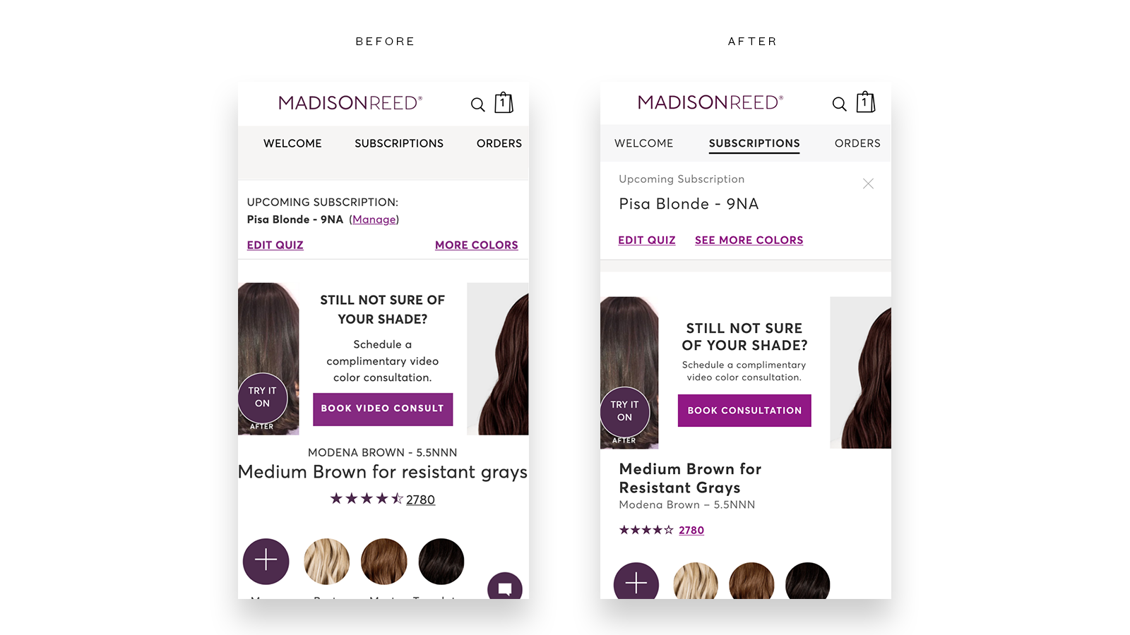
[Above] Clear parity between logged-out and logged-in states, improved visual hierarchy, improved readability.
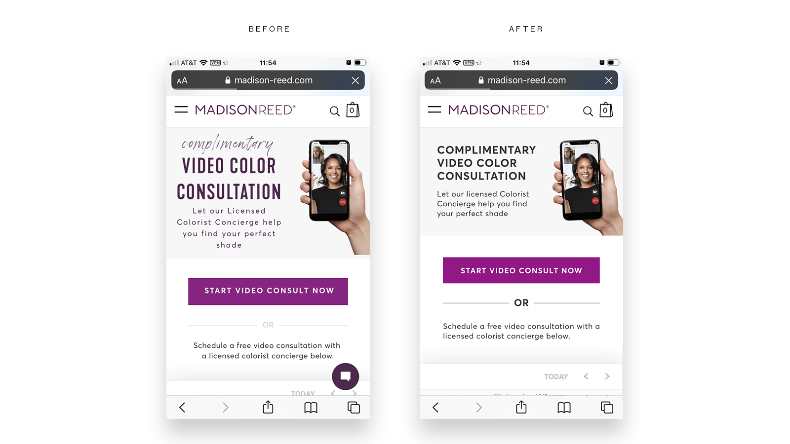
[Above] Elimination of decorative fonts, drastic improvement of type formatting, readability, and design execution.

Visualizing Powerful Applications of Design Systems The above “Before and After” views showed the executive and product teams the value and power of design in directly influencing and improving conversion (and therefore revenue) and the user experience.
Dramatic Result
The impact is visbile: clean, easier to use, prioritized purchase-empowering, and aligned to user needs. With a simpler experience, conversion improved through reduced effort and friction for shoppers, not just to purchase but on MULTIPLE fronts: purchase, subscribe, get consult, book salon appointment, and others. WoW, MoM, YoY conversion data and ∆s before and after are confidential.
Job & Role
Consulting Product Design Director
Participation
Strategy and Design Leadership, Facilitation of Multiple Design Thinking Workshops, Hands-on Principal Product Design, and both hands-on and oversight of delivery
Abilities
Brand Strategy Audit, Sustainability Ethos Compliance, Sustainable Business Model Development, Service Blueprint Design, Storytelling, Use Case Definition, Research Synthesis, Scenario Development, Journeymapping, Journey Moment Design, System Thinking, Workshop Facilitation, Data and Workshop Output Synthesis, Insight Development, Competitive Research, Opportunity Analysis and Synthesis, Prototyping, Visual Interaction Design, Experience Design, Concept Development, Adaptive/Responsive Web Design, Mobile App Design