Anonyome/MySudo
Redesign the entire service experience in the mobile app to empower people to create a safe, protected digital identity, allowing them to take back control over their online presence.
Background Context

Company
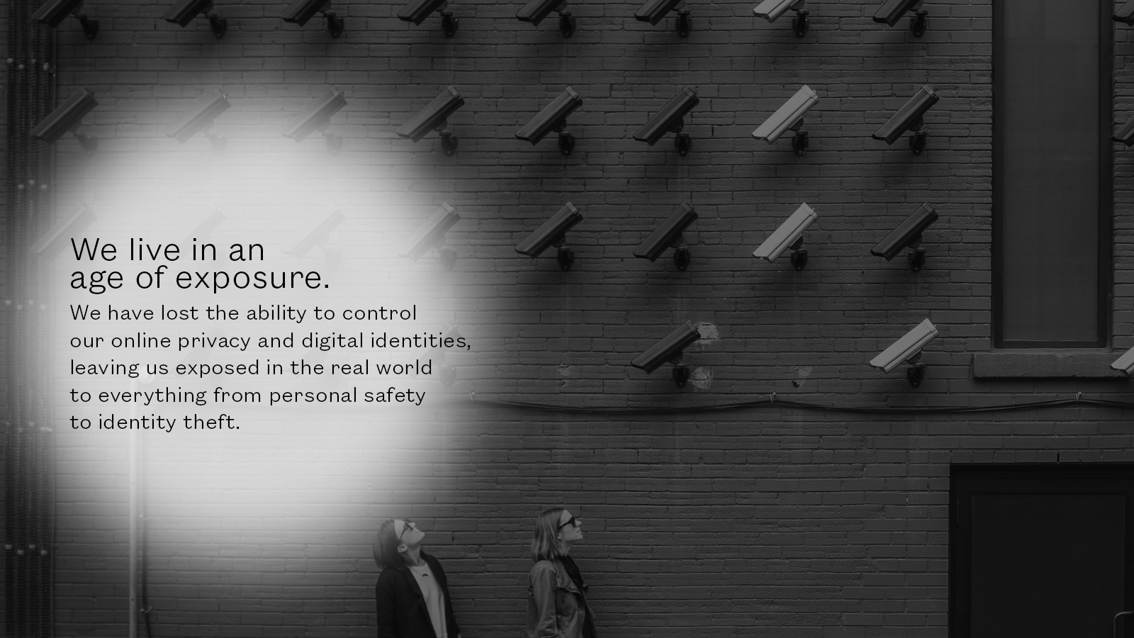
MySudo app, developed by Anonyome (“uh-non-uh-mee”) Lab, was created as a way for people to fortify and take back control of their online privacy through secure text, phone, and email. The belief in one’s fundamental right to preserve and define their identity is their core ethos.
Product Description
MySudo is the name of the app, centered around a “Sudo:” an anonymized, customized profile a person can create for a specific purpose (shopping, dating, socializing, or communicating). Actual personal information is never provided to Anonyome nor is Sudo information saved, true to its ethos of reinstating privacy and control of people and their data.
Challenge
Anonyome successfully built a technology platform for Sudos, but its biggest challenge was creating a seamless user experience using them. The MySudo app didn’t communicate its value nor “pay off” its brand promise, saw extremely low return visit numbers, and was eviscerated in app store reviews as “confusing,” “broken” and “doesn’t work.”
Work Description
I lead a team and worked hands-on on two interrelated projects: 1) define the product brand, its core value propositions, functions, and use cases and 2) redesign the app experience to be easy, simple, and obvious for its users. This was an End-to-End (E2E) branded product experience wherein the content strategy was important as the design concepts that solved major UX problems.
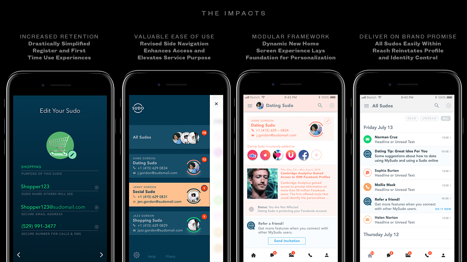
Results
User and usability testing throughout the project yielded “night and day differences in terms of understanding what this app does.” App store downloads went up 30+%, return sessions after sign-up went significantly (~18+%), and the number of Sudos created also increased across the entire user base. The success of the consumer app experience laid the groundwork for building a larger part of the business: platform software and licensing its platform to major partners.
This case study is a classic success story of “less is more.”
Details
 Goal 1: Communicate Immediate Value and Utility
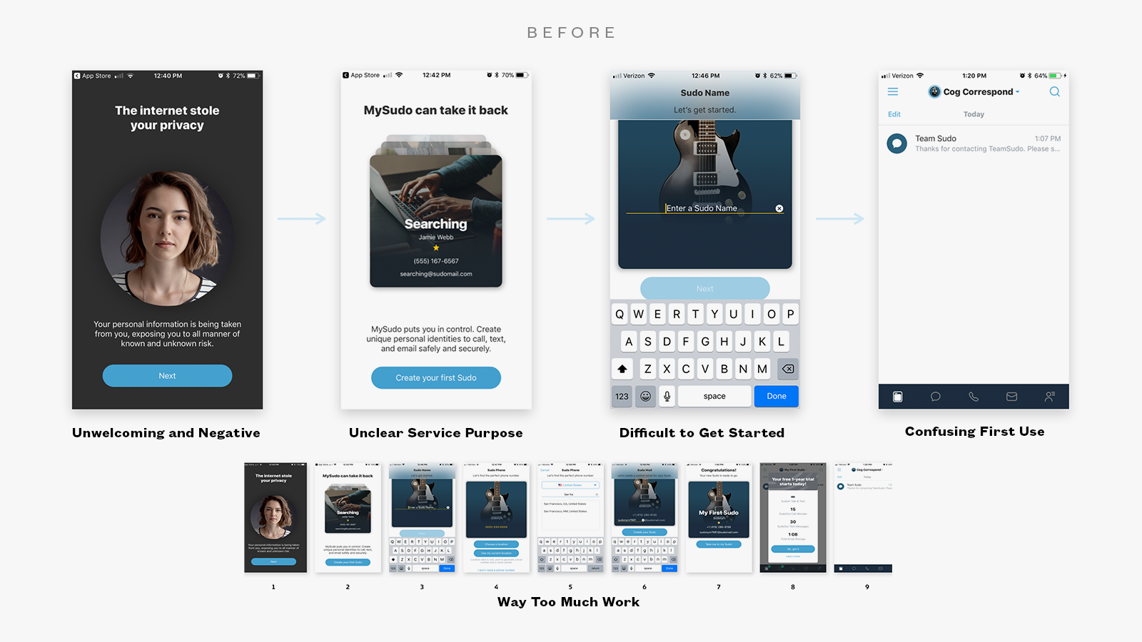
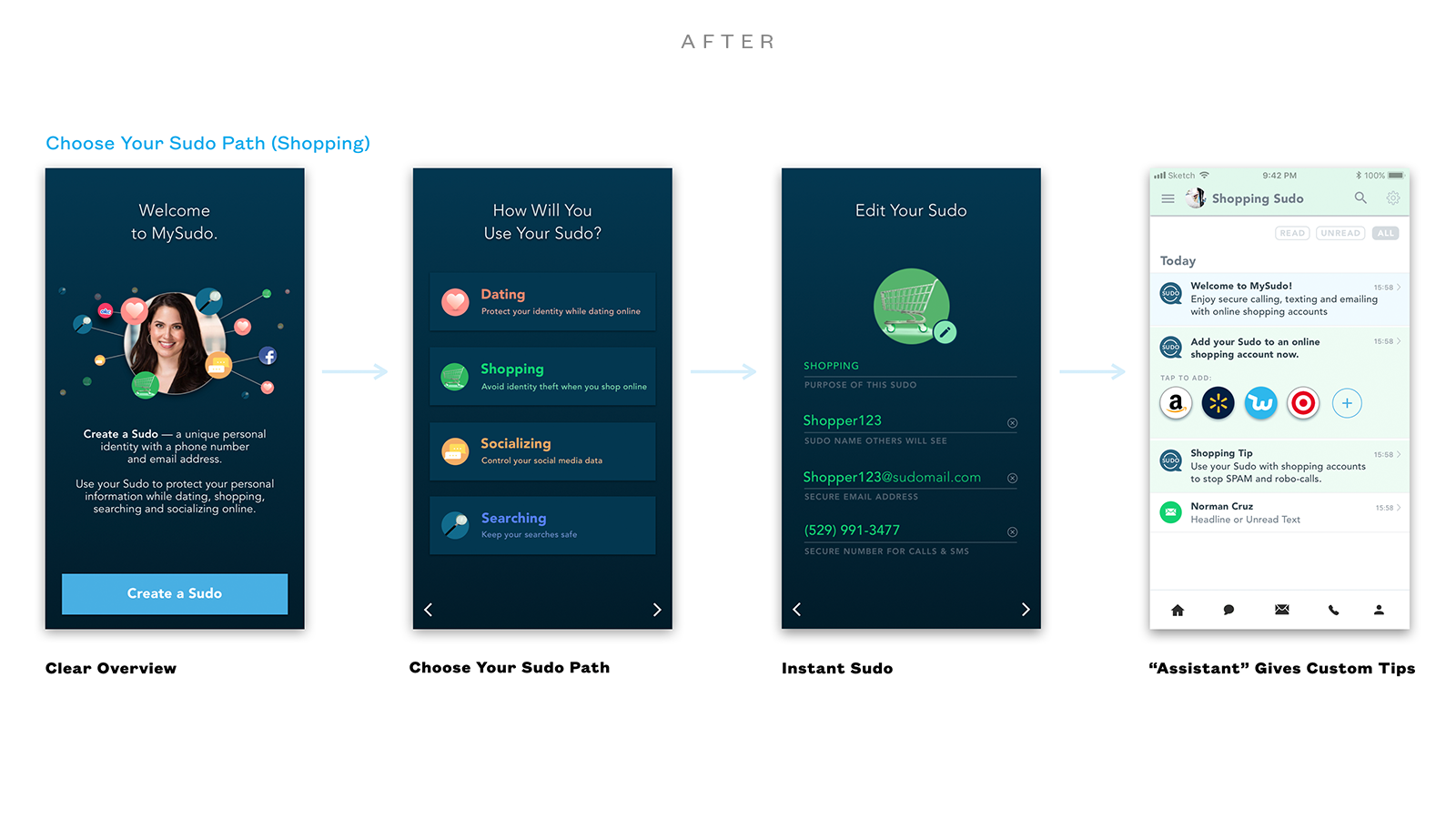
 Simplify Register and First Use
[Above] The “before” experience was dreary, confusing and so much work. Updates were made to the product brand color palette, storytelling was streamlined in the register process, and we reduced the Register process from 9 screens and 8 steps to three screens and two teps. This was possible through use case identification, prioritization and validation, pre-populated editable fields to demonstrate “how it works” and using the “First Use” screen after register to communicate clear directions, value, and next steps. User feedback was overwhelmingly positive.
 Goal 2: Deliver an Engaging and Rewarding User Experience
 Standardizing Basic Actions, Simplification of Use
[Above] Depending on the use case and purpose of Sudos, different actions required different account linking. Flows and basic actions were standardized and made obvious, with clear directions while people specify how they want to use a Sudo. Dating apps were the most confusing types of experience to manage safely and anonymously, but at the basis level it was just about adjusting profile settings in existing accounts.
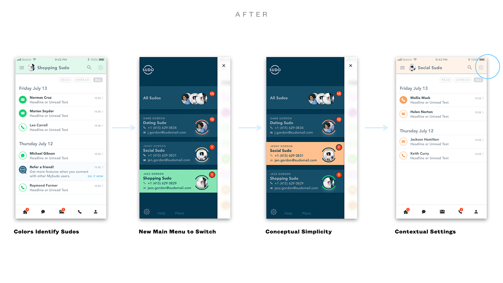 Goal 3: Simplify The Experience of Mulitple Sudos
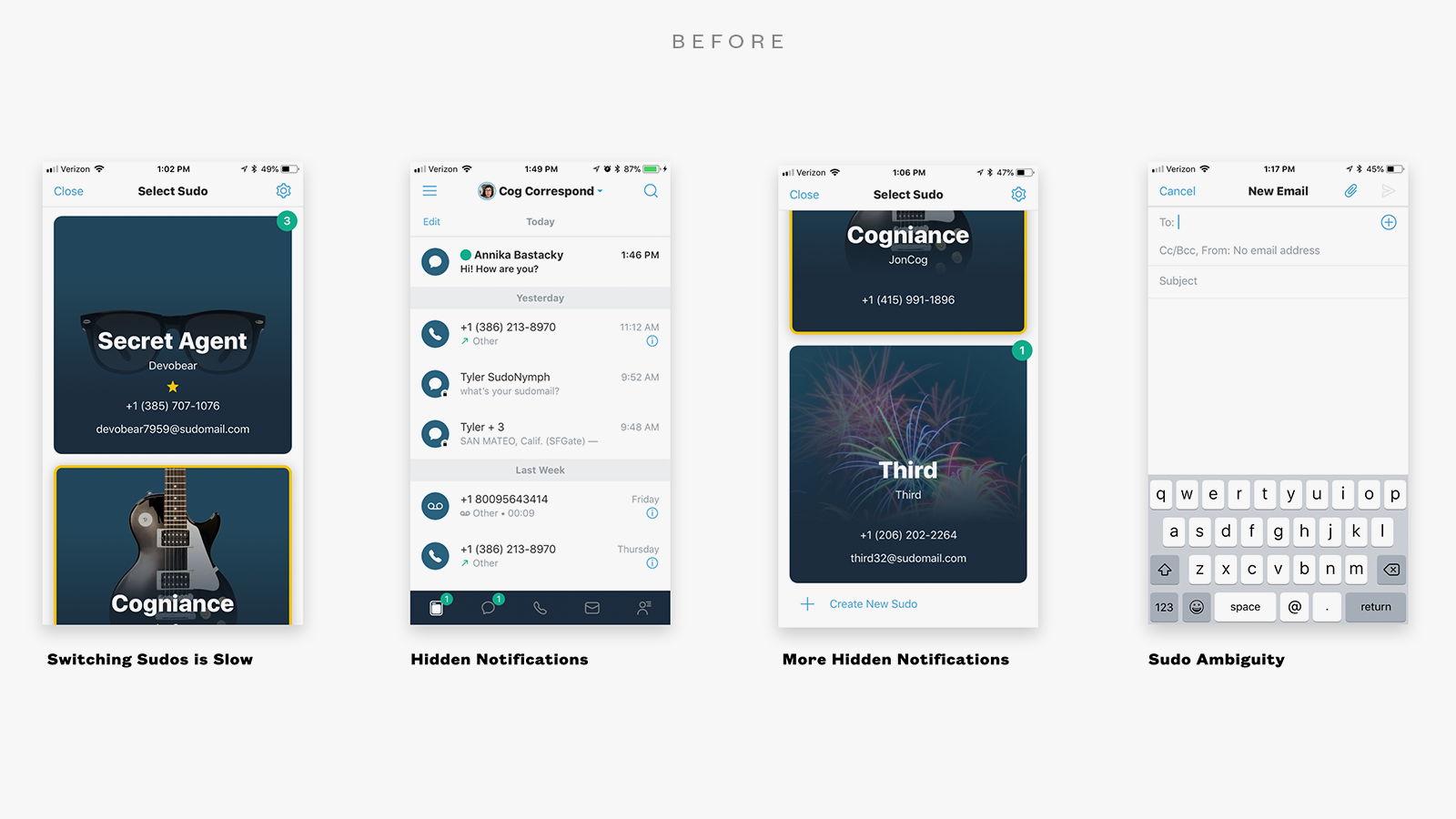
 New Navigation, Easy Switching
[Above] People use separate Sudos for separate purposes (Eg. – Dating vs. Shopping Online). Previously, there were hard-to-use navigation elements and too many confusing interaction modules stacked in an ineffective vertical format. A new, simple side drawer navigation paradigm was used to show “tile buttons” for each Sudo, bringing simple switching all within thumb’s reach. Settings for each Sudo were contextual and available to modify any Sudo any time.
.

Goal 2: Deliver an Engaging and Rewarding User Experience
New Home Screen, Modular and Expandable
[Above] One of the most broken aspects of MySudo included no valuable information nor access to data was offered in a consolidated landing or dashboard home screen. A new experience was introduced that pulled together insights, updates, and activity. And the “voice of MySudo” as an “intelligent assistant” was introduced to more effectively bring empowerment to people through AI-based recommended actions.
RESULTS
The MySudo E2E App Experience Dramatically Improved
Not only did the app see greater app store downloads and better reviews, but Sudo activity increased dramatically alongside return visits to the app. Download, completion of the register flow, and return visit metrics all increased by double digits. People who participated in testing and feedback sessions described the app as “essential,” “empowering,” and “a ‘must-have’ for doing anything online.”
.
Job & Role
Consulting Service Design Director
Participation
Product and broduct brand strategy and design initiative leadership, managed a team of 4-6 designers, occasional hands-on product design work
Abilities
Domain Research, Audience Segmentation, Scenario and Use Case Analysis, Development, Prioritization, and Audience Validation, Product Strategy, Brand Strategy, Content Strategy, Design System Enhancement, Product Design Concepts and Production, A.I.-driven Content Strategy, Interaction and Visual Design, User Testing, User Feedback Sessions, Usability Studies